How To Increase the Conversion of Web Forms on a Homepage?
A web form is the most important process for interacting with site visitors to obtain data of various kinds. Filling a form would not be the most exciting activity, so if it is not user-friendly you often do without it.
Fortunately, there are certain tricks and rules can be used to positively influence conversion. Today, web forms are almost everywhere such as registration, ordering, feedback, newsletter registration, etc. Therefore, it would be important to focus on optimizing the forms. Let’s start with the basic rules of web form optimization…
Design and Construction
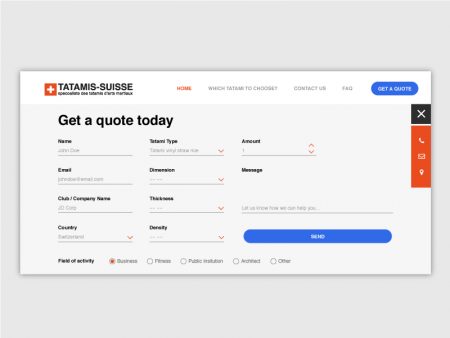
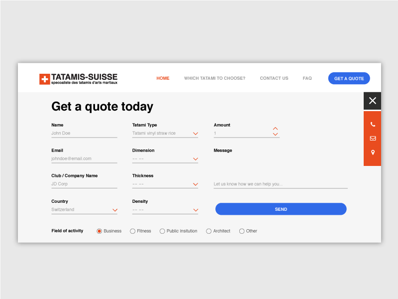
The basic principle applies when creating web forms is “the less, the better”. The fewer fields you use the less time and effort will be required from the user side. The requirements would be mainly as follows: clear, simple and predictable. You need to minimize the inconvenience to users when form filling since it is exhausting for them anyway.
-
Design
All web form fields should be implemented in white color so that the form is easier to read. The use of a different color may indicate that the respective field “by default” is filled out and is no longer editable. The field currently being filled should desirably be highlighted with a colored frame. If for some reason the user gets distracted, it is possible to quickly locate the place where one has stopped filling using the color frame.
Also pay attention to the contrast ratio of the fields, the fonts and the background of the website. Badly chosen colors and lack of contrast make it much more difficult to complete the web form.
-
Font
When composing the texts for the web form you prefer to use standard fonts like Sans-Serif, Verdana, Arial, which can always be displayed correctly on the screen. Do not save space and do not use too small a font size. When it comes to a larger web form, divide it into multiple sections and do not try to place all the information on a screen.
-
Layout
The thing is purely individual. In one case, a creatively designed form can help increase conversions; in another case, it would only discourage visitors.
There is no clear solution. You would have to consider the yes and the contrary in each case, perform tests and analyze results.
Construction
-
Number of fields
Forms that are too long only deter visitors. Keep the number of fields to the minimum necessary. The principle is simple: Request only the most necessary information, without which no registration or order is possible. For example, if you offer a newsletter subscription, just ask for an e-mail address.

Often forms with optional fields occur, where the mandatory fields are marked with an asterisk. Sometimes these optional fields are needed, for example, you can specify an action code there. But if the extra fields only serve as a reason to collect more information, you’d rather forego it for the reasons.
-
Call-to-action Button
The page with the web form should only have a call-to-action button, which should be big, eye-catching and high-contrast.

Label the actual button with the text that describes the particular action expected by the user or its advantages when clicking and proceeding, such as: “Get a ticket for free” or “Download application”.
-
Captcha
It’s probably the worst thing about a form. Do you think it would be important to use this element? Then keep it as simple as possible. Otherwise even the most patient users would leave your site after some unsuccessful attempts to enter the weird strings.
-
Dividing the web form into several areas and progress bar
Ideally, a web form should be placed on the site where it can be seen without scrolling. If your web form is quite extensive, it would be useful to divide it into several consistent areas. A good solution would be the use of a so-called static progress bar in the form header. As a result, you can immediately see all the steps that await him, as well as, if necessary, to return to the respective step to adapt something.
-
Adjustment to mobile devices
When you design a web form, you also adapt it for use on mobile devices so that it can be displayed properly on the screen of a computer or Smartphone.

Thus, completing the web form fields can be much more user-friendly for mobile device users and reduce the number of denials.
Contents and Functionalities
When designing a web form, it is important to consider not only its structure and appearance but also the inner contents. Headings, annotations, auxiliary elements greatly simplify the completion of the fields and contribute to the increase in conversions.
-
Heading
The headline position tells the user where (on a web form page) and what (registration, login, order, etc.) he is currently located.
-
Field Descriptions
The experts have different opinions as to where the descriptions of the fields are best placed. If the field descriptions are positioned above the fields, it will be better visually perceived. On the other hand, this process makes the form visually longer, so it seems higher. The positioning of the descriptions on the left makes the structure more compact but requires sufficient space over the web page width. To find the optimal solution, test different variants and track the changes to the conversion.
-
Validation
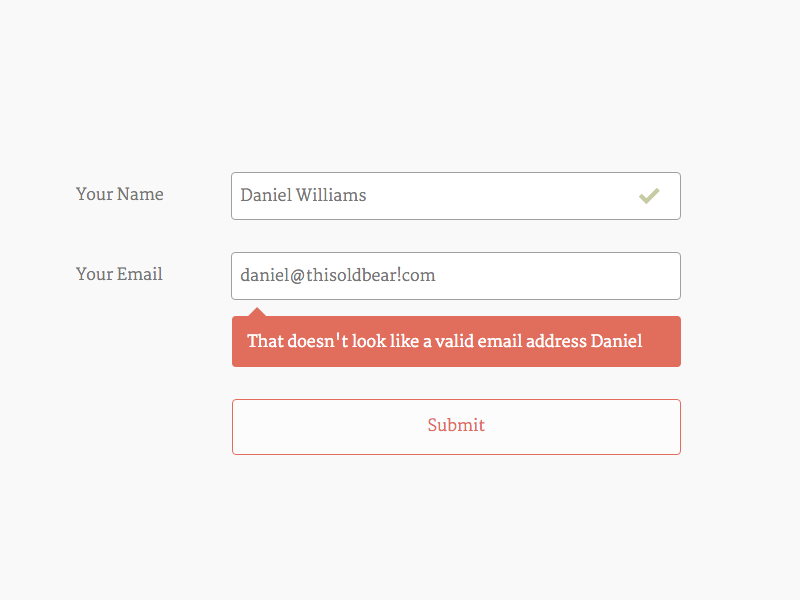
Users often make mistakes when filling in forms. Through the validation, a made mistake can already be discovered during the filling of the fields and corrected immediately. If you make mistakes, do not let users guess what you typed incorrectly, but use explanatory tips.
-
Data Saving
Sometimes you only learn about an error made in form filling after clicking the Apply button, and then you see disappointingly empty fields. The likelihood of refilling the web form is extremely low. To make sure that it does not occur, the correctly entered data should be taken over, so that the user is then requested to process only those fields that contain errors.
Analyze Form
When working with the web forms, the main rule is to evaluate the conversion. All your efforts will be of no use if you do not know where and why users are leaving your homepage. Each web form step is a point to analyze. Keep track of what step users are experiencing and see what’s causing the trouble.
As an aid to measuring web-form efficiency, various analytical systems are available to you.
Conclusion
There is no ideal formula for creating a good web form. What works well on one homepage may be worse for another website. Therefore, when creating your web form, it is important that you must constantly perform tests, and analyze the behavior of your users. Then draw the right conclusions, and work on the optimization. Only in this way you can improve the usability of your web forms and increase their conversion.


1 Comment
shivkumar · May 3, 2019 at 12:04 pm
Thank you very much. Really I didn’t understand web-form as much as now after reading this article.